Typography 2
Graphic Design1

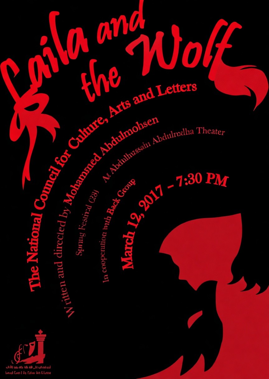
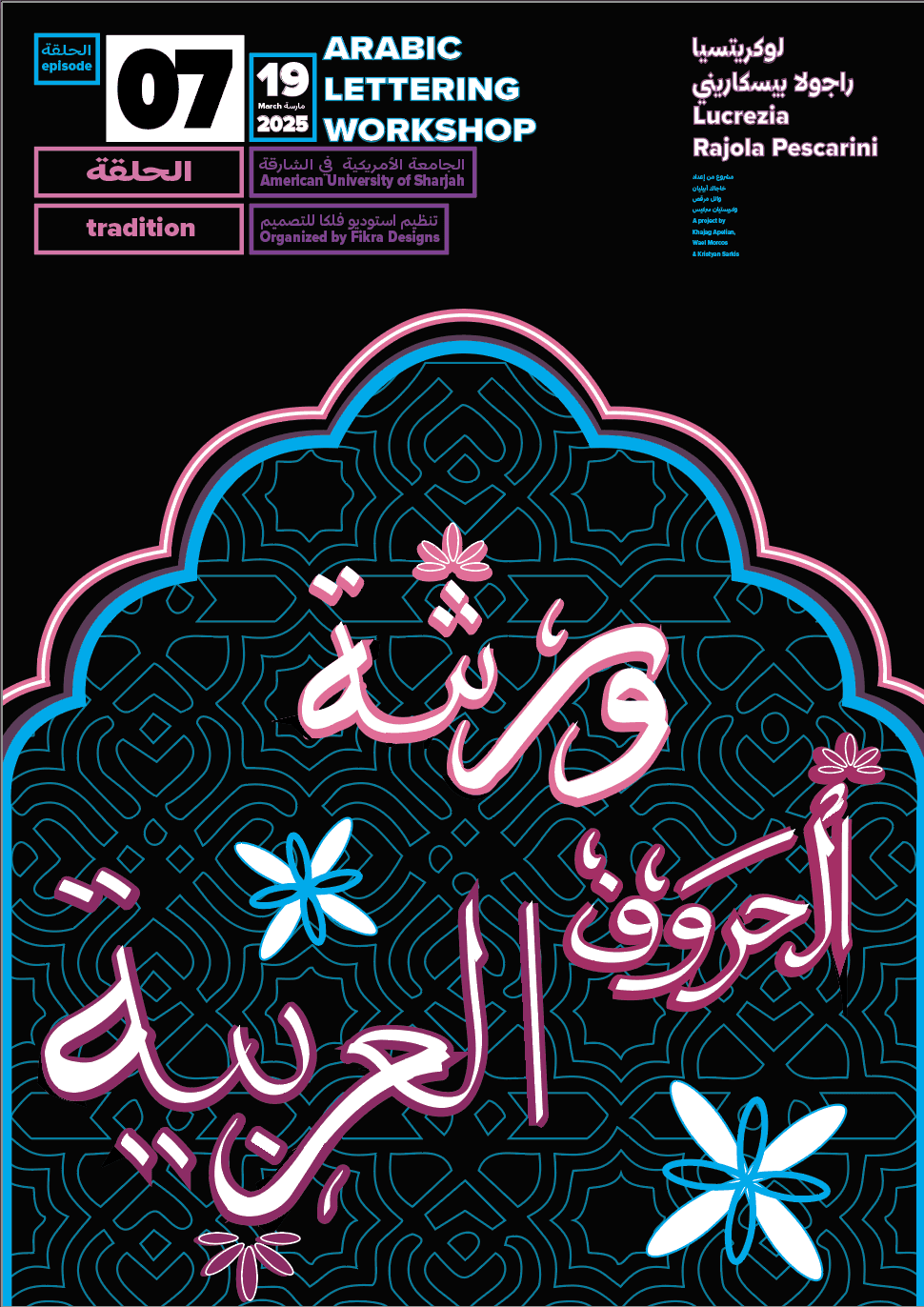
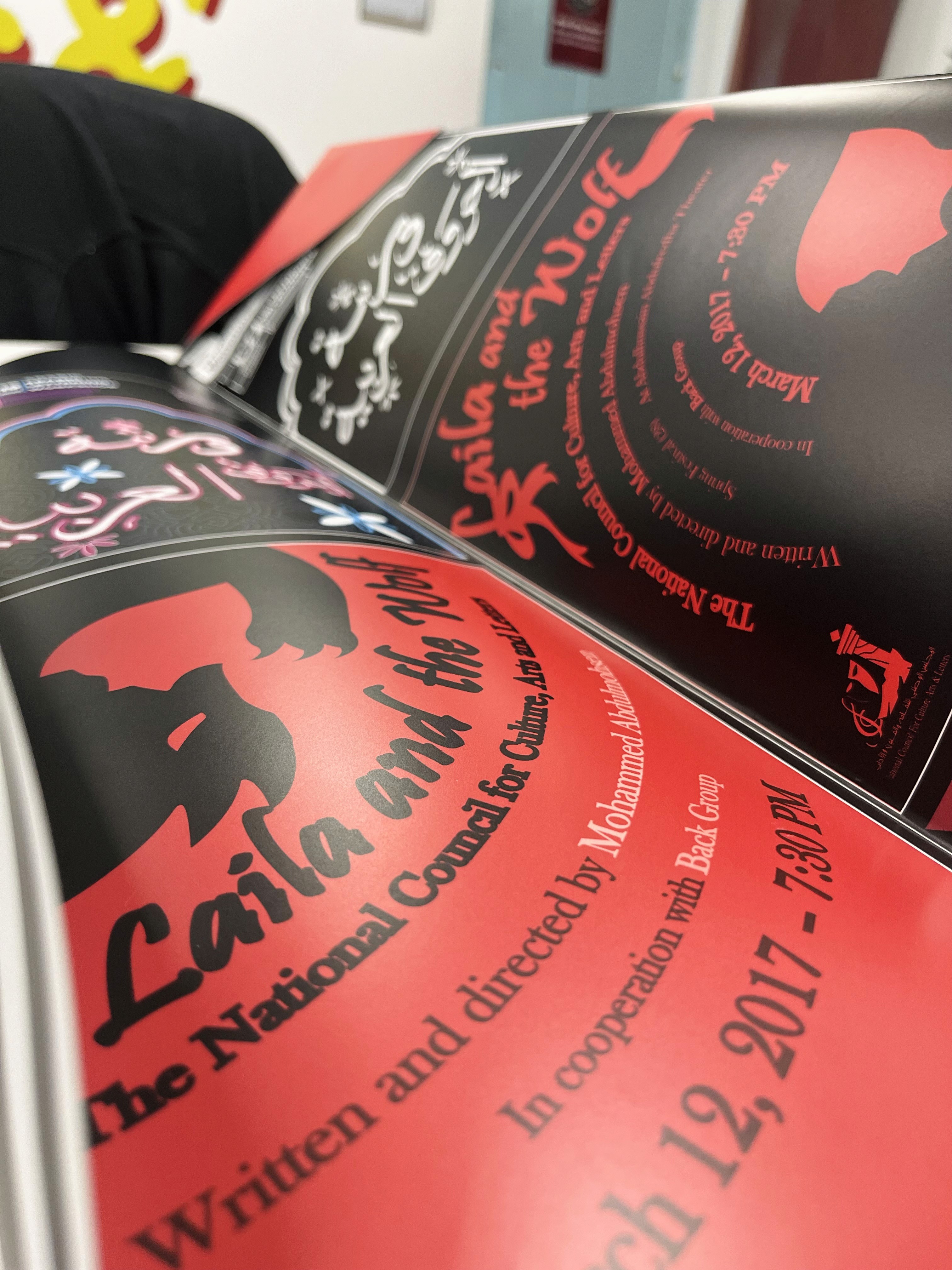
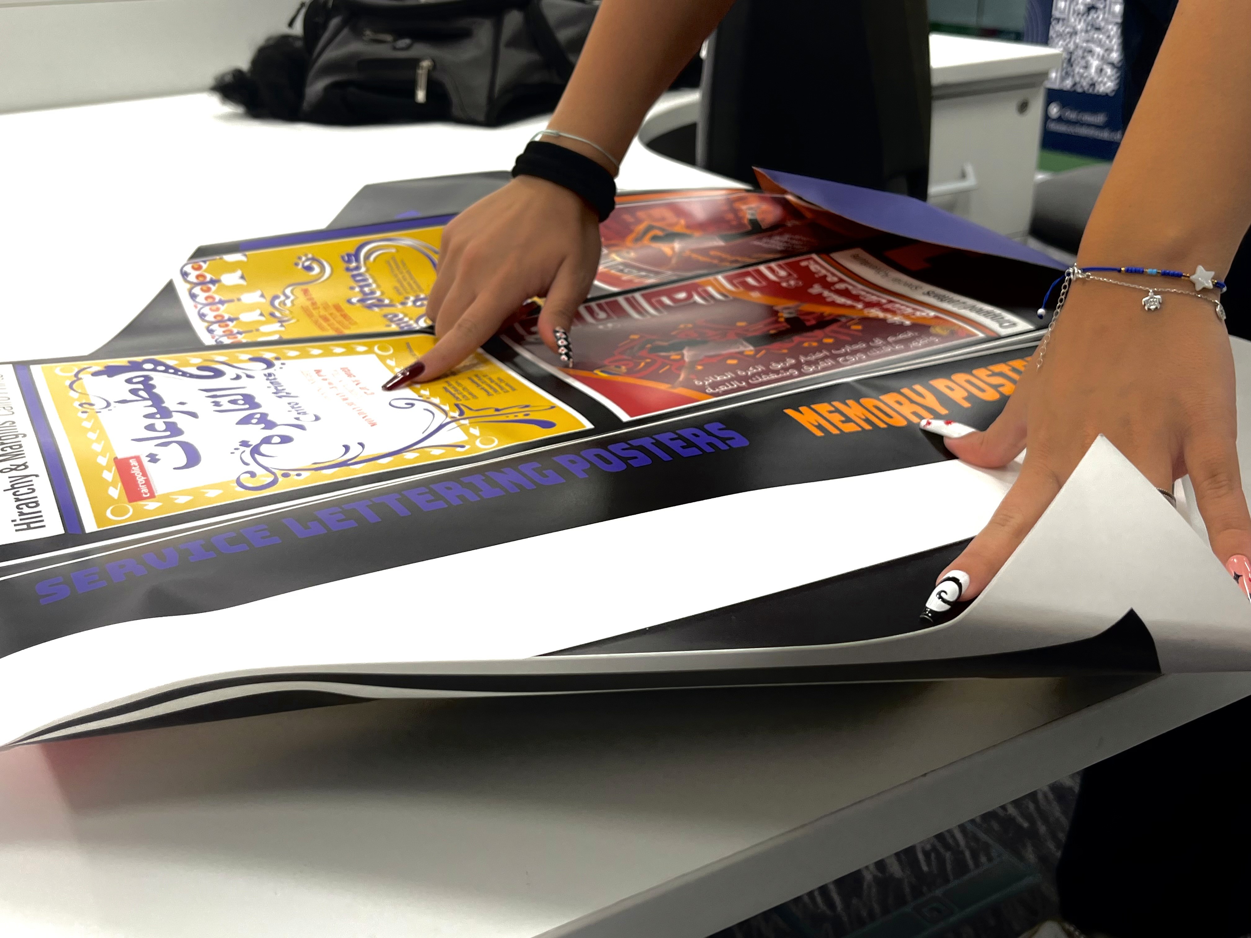
Project 1: It consisted of creating 8 posters based on 4 themes chose among options provided to us. For each theme we had to create 2 versions. Additionally to the theme, we also had to match it with a typographic requirement, which were also provided to us.
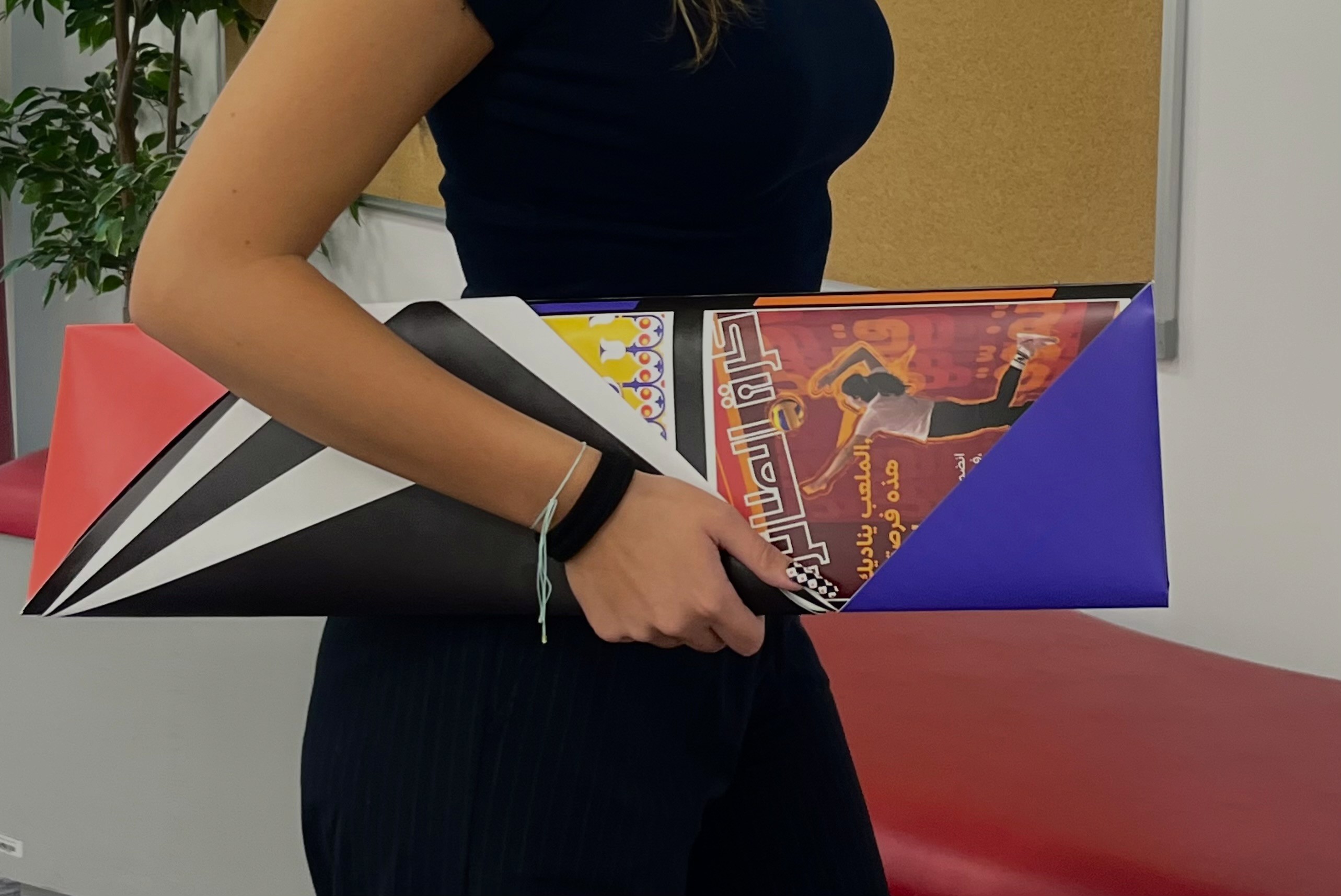
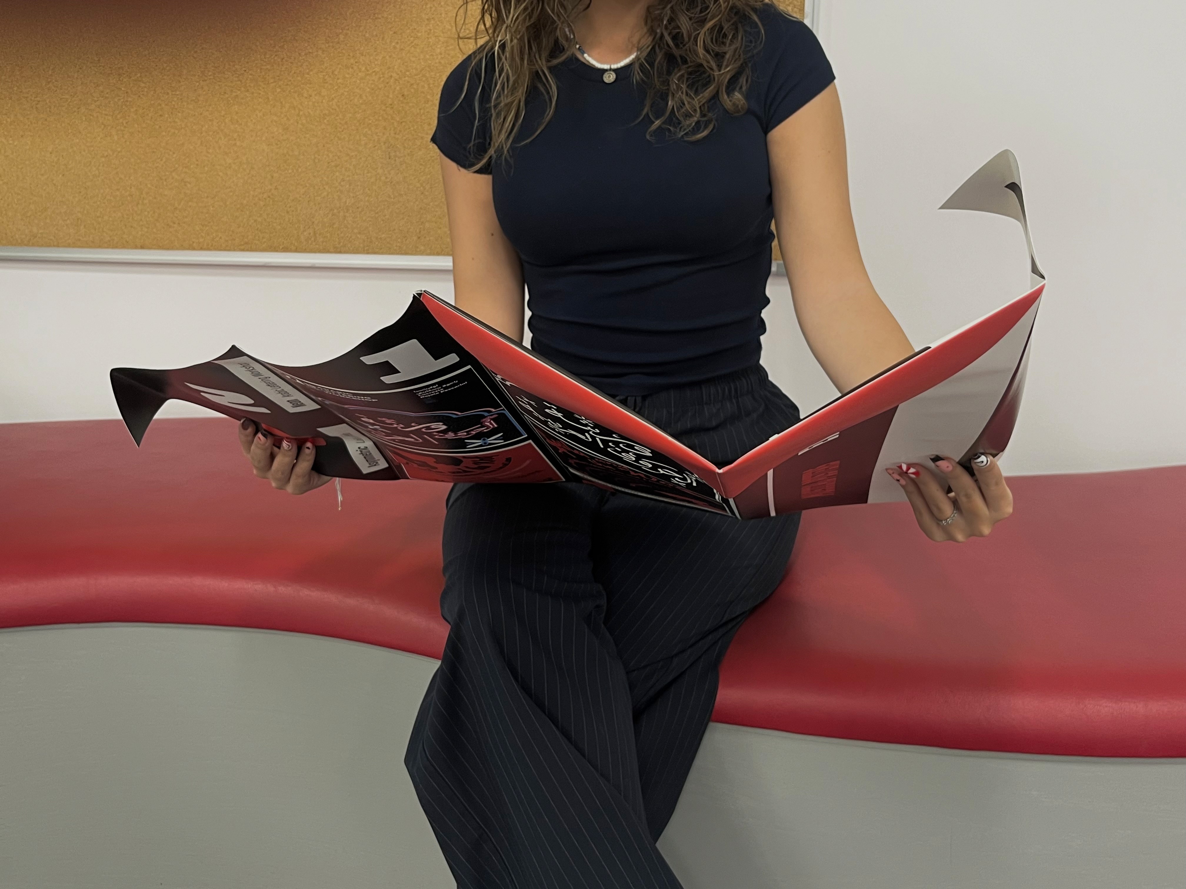
Final requirement was to create a A2 mockup for the posters, but have it fold and present everything in an interesting way. I decided to push the boundaries of the limited canvas provided to us, and create an unconventional layout for the project. It reflect my desire to present the designs in a new, tactile way, but it was also the layout that would have brought my posters together.


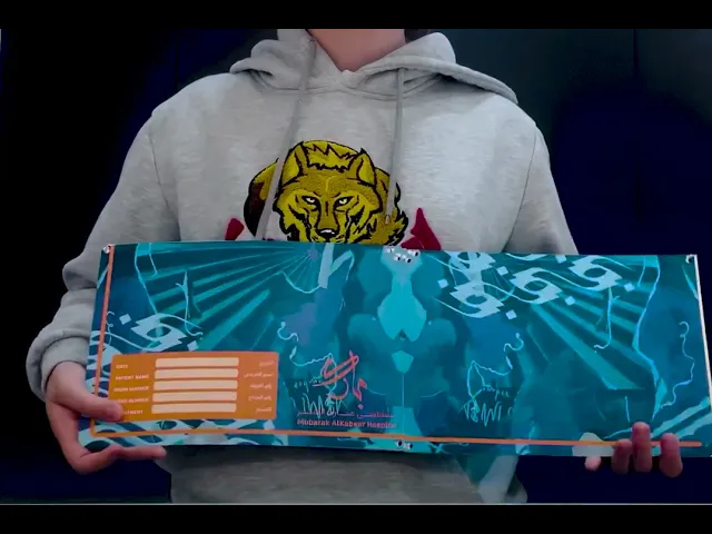
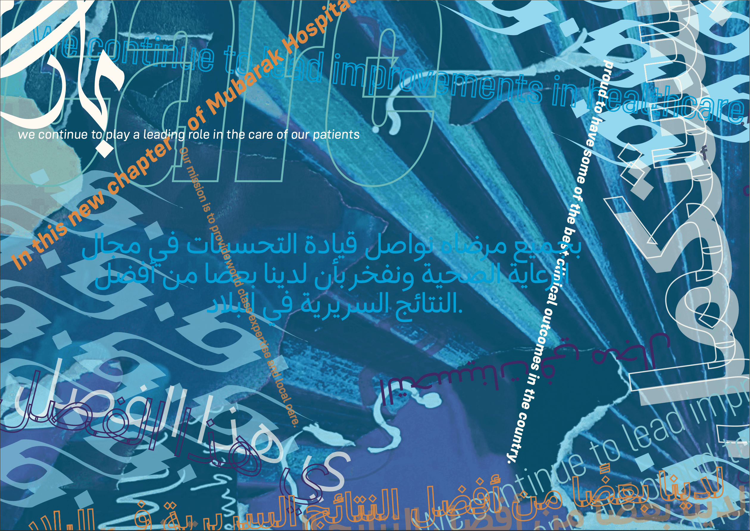
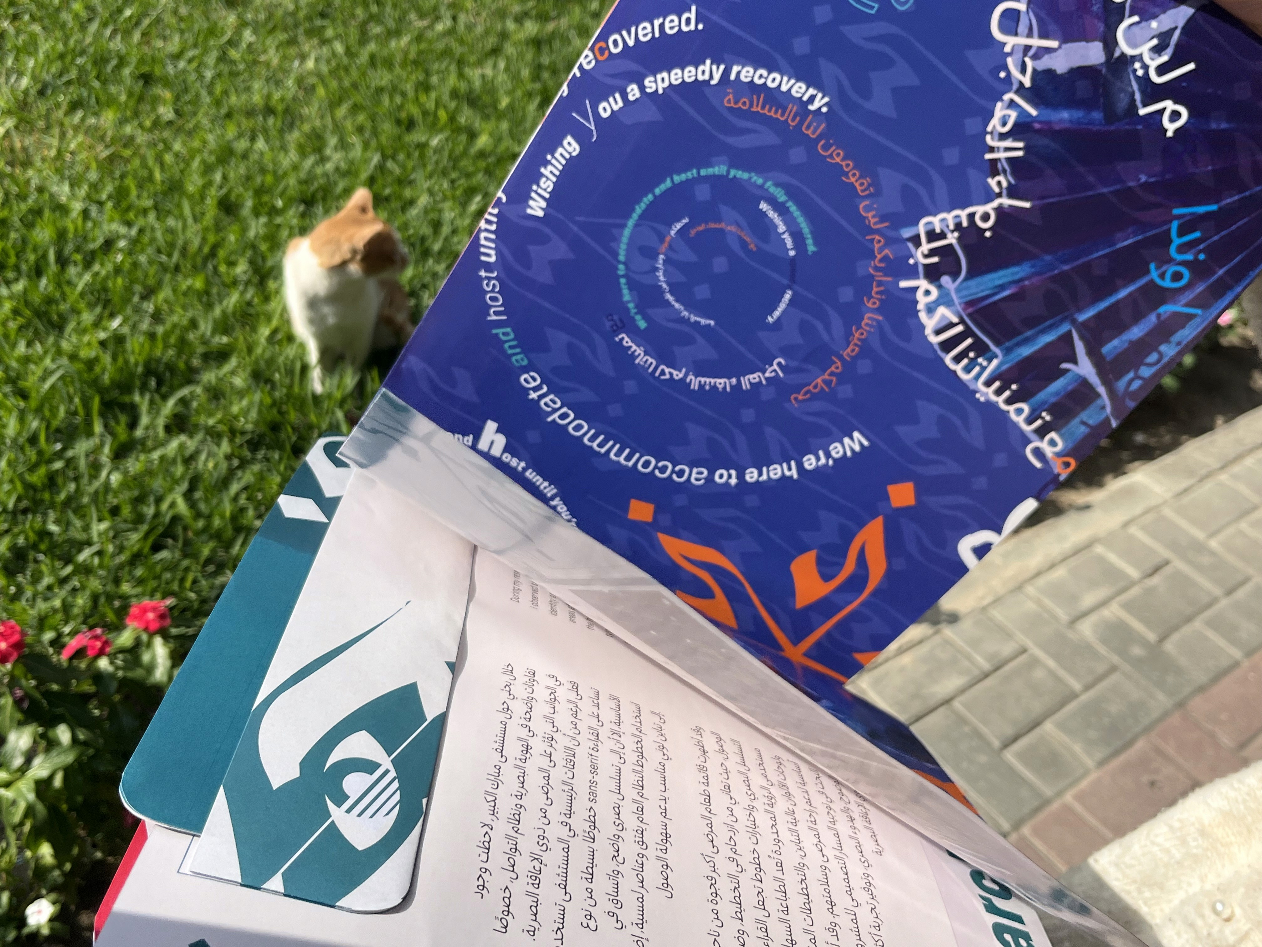
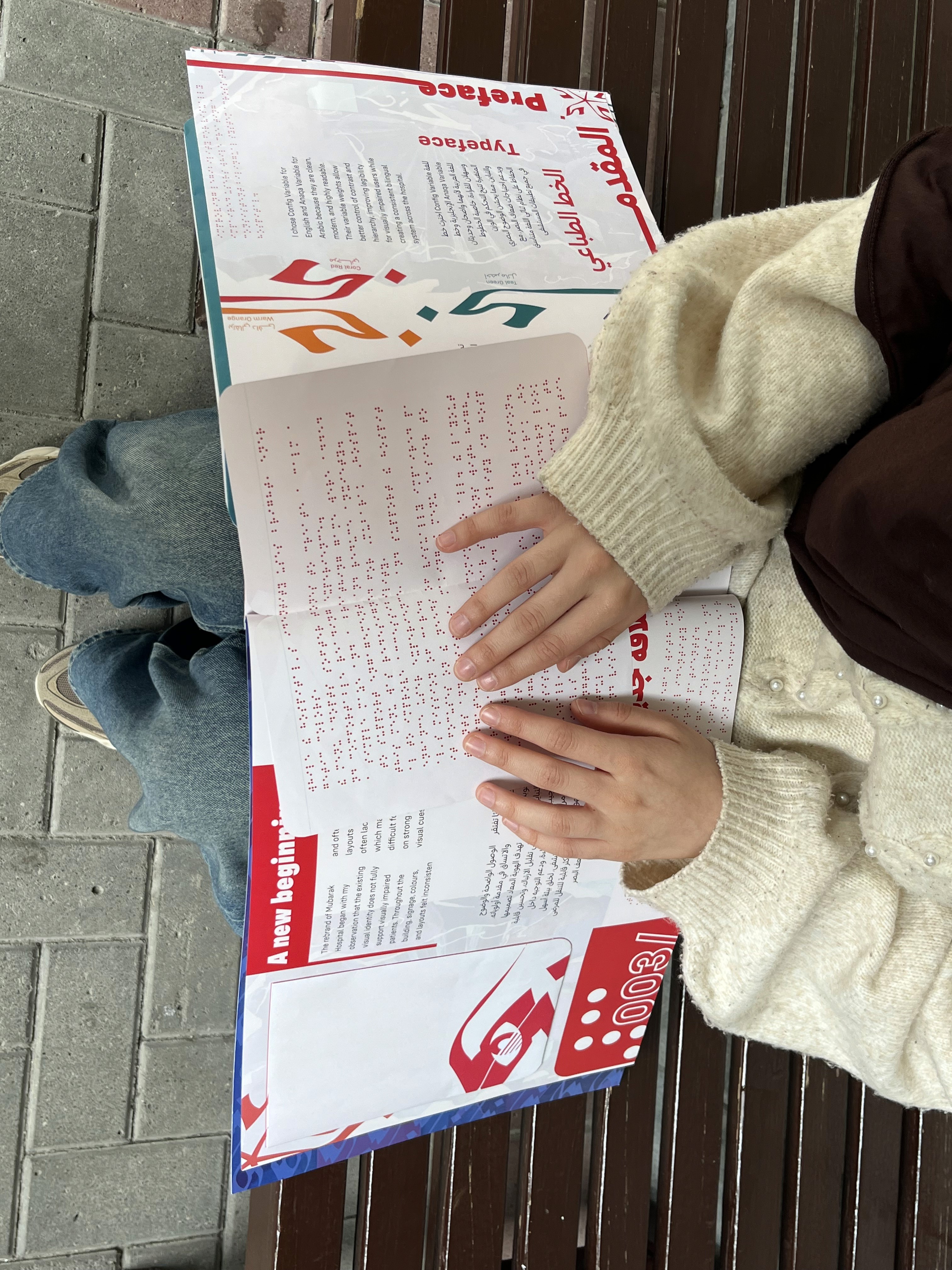
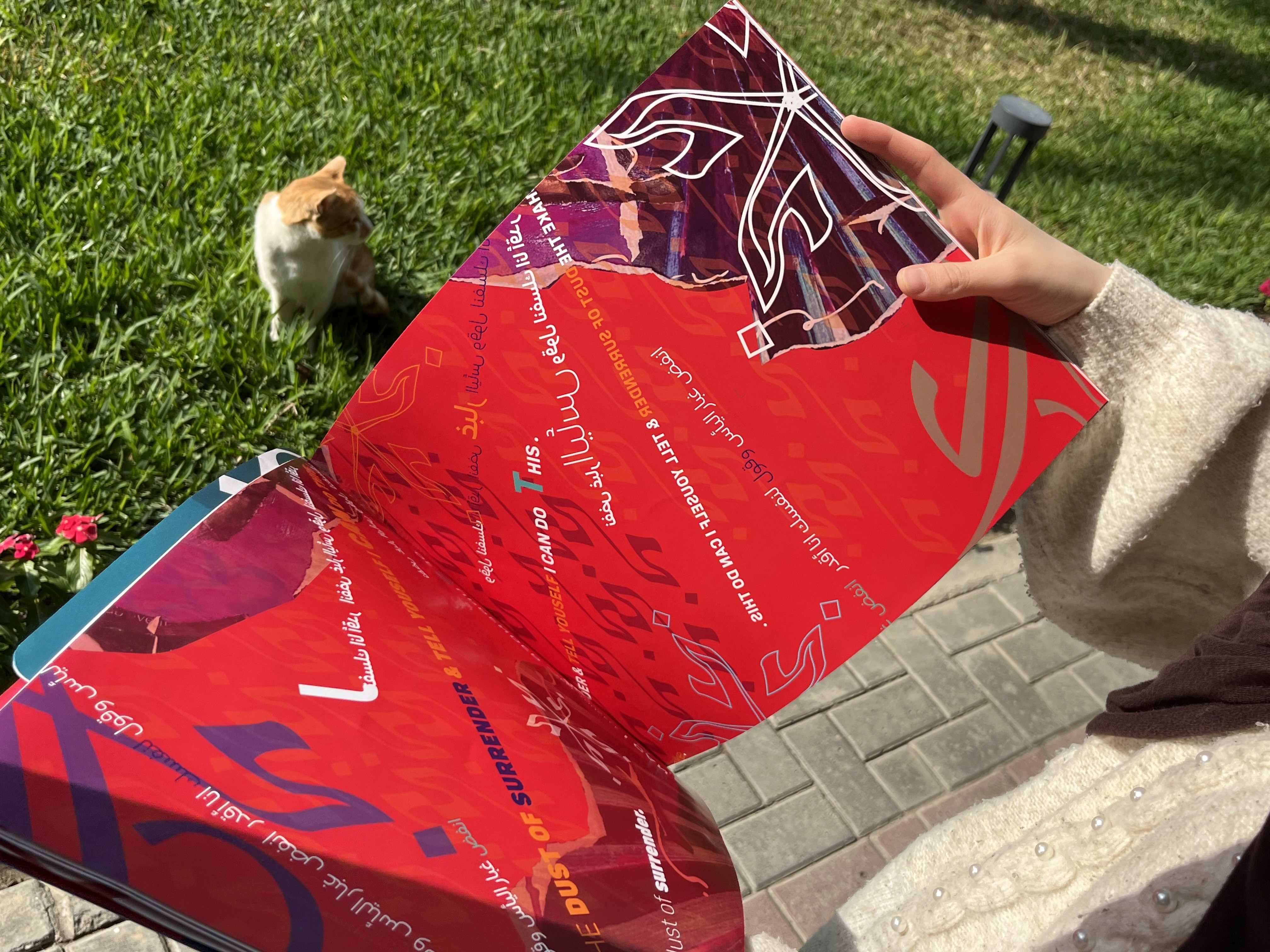
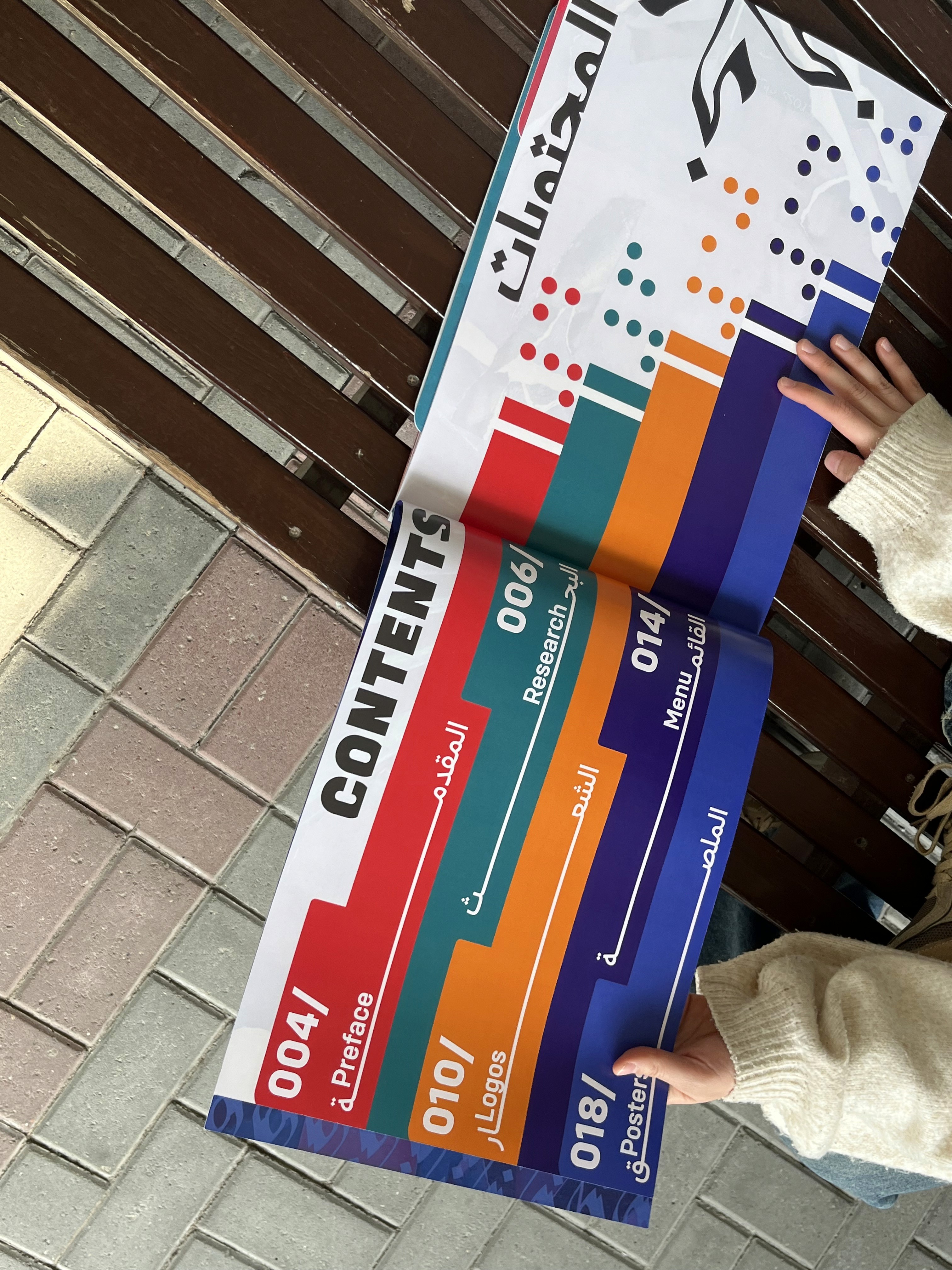
Project 2: It consisted on rebranding the Mubarak al Kabeer Hospital based on patients target audience of our choice. The main project was to redesign the patient menu, create a WIP ( Work In Progress ) and use it in our rebrand, create a brochure dedicated to the rebrand idea, and a poster for the hospital. Everything had to be bilingual.
For my target audience I decided to focus on visually impaired patients. Visually impaired individuals are a part of the population that experience varying levels of vision loss, ranging from partial sight and low vision to total blindness.
To remain truthful to my patients, I made extensive research on how be of support to them , and tried to follow the WCAG guidelines. They provided a clear framework for evaluating readability and contrast. Meeting WCAG AA and AAA contrast ratios ensured that text was readable for users with low vision, color-vision deficiency, and age-related visual decline.
Menu.
Menu folding showcase.
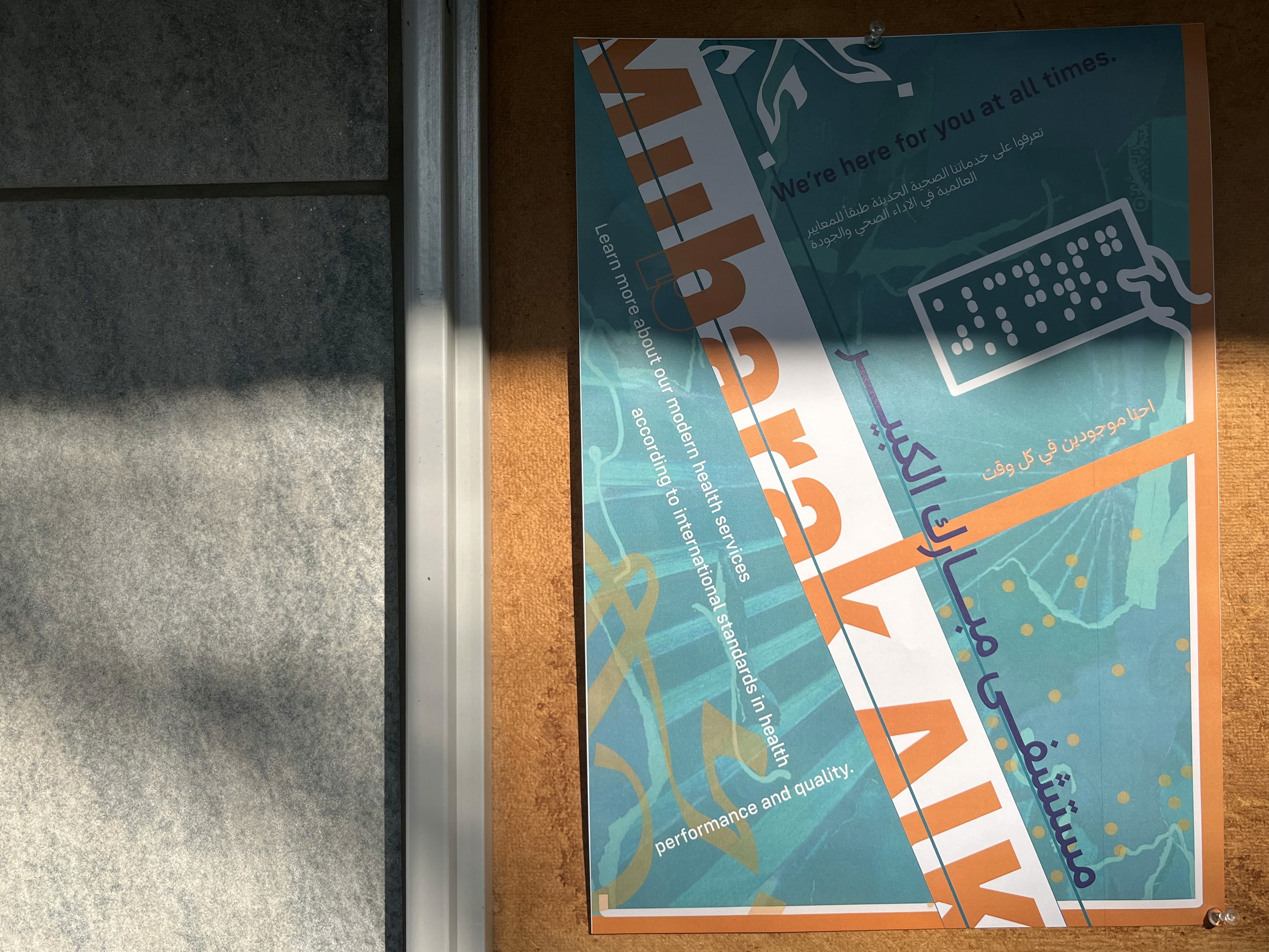
Poster.
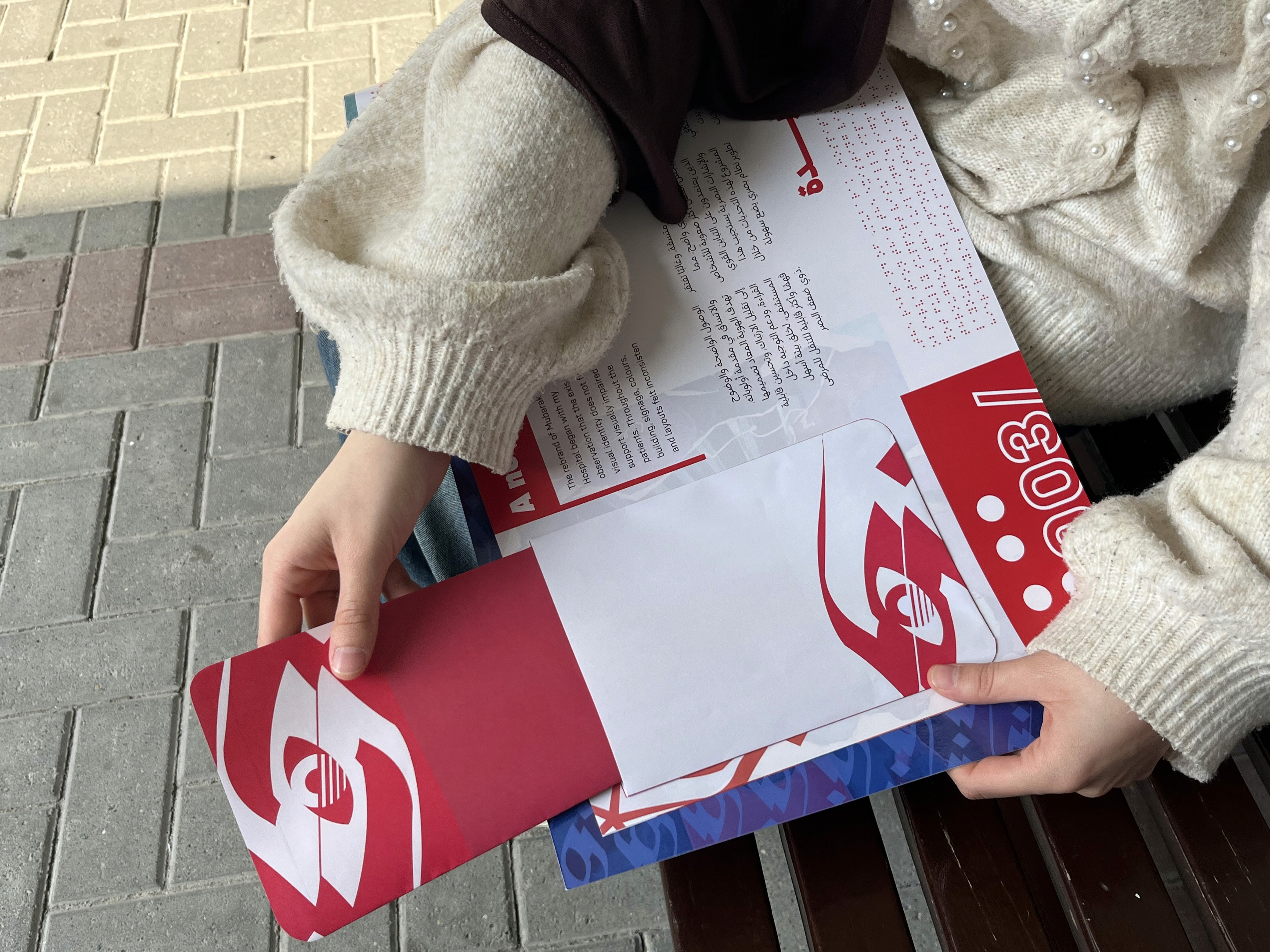
Brochure.

Final project: It consisted in creating a futuristic train station design. It was a group project. We had to produce a 3 wall exhibition, tickets, railroad map, kinetic poster and way finders.
Our futuristic train station was designed through Pulse Movement.
Built on human activity levels: low pulse = residential, mid pulse = work, high pulse = leisure.
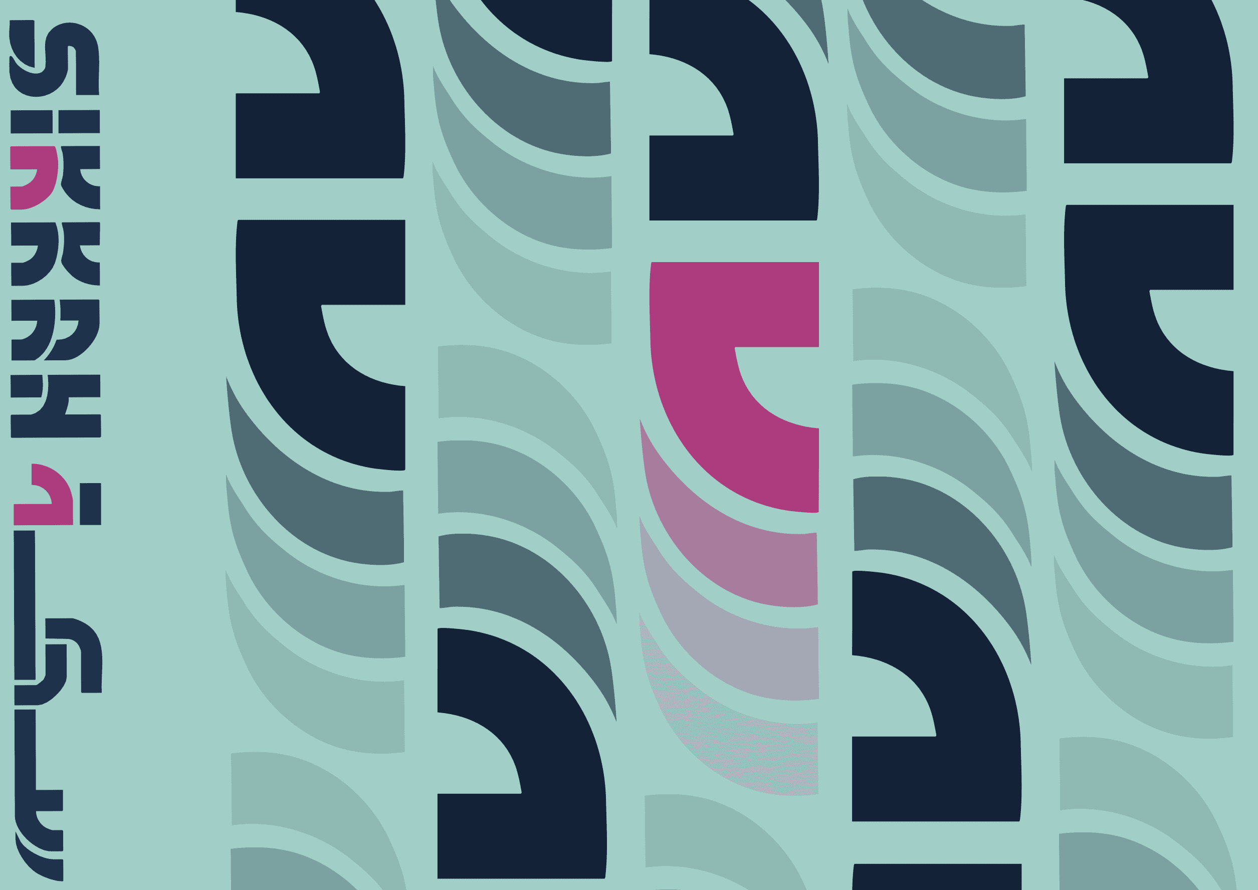
The pulse system comes from the Arabic س in our logo, turning a letter into movement, rhythm, and wayfinding.
For the exhibition: an interactive center table map that shifts color on click, a pulse-matched train design, and a spotlighted poster to set the scene.

Railroad map.
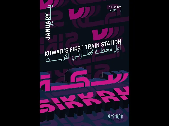
Cinetic poster.


Exhibition.